
-
Welcome
Welcome
-
Designers
Get Started Designers
-
Developers
Get Started Developers
-
Button
Elements Button
-
Error
Elements Error
-
Event
Elements Event
-
Label
Elements Label
-
Loading Spinner
Elements Loading Spinner
-
Pill
Elements Pill
-
Tag
Elements Tag
-
Toast
Elements Toast
-
Tooltip
Elements Tooltip
-
Checkbox
Forms Checkbox
-
Date
Forms Date
-
Email
Forms Email
-
Input Group
Forms Input Group
-
Number
Forms Number
-
Radio
Forms Radio
-
Search Select
Forms Search Select
-
Select
Forms Select
-
Tag Input
Forms Tag Input
-
Telephone
Forms Telephone
-
Text
Forms Text
-
Textarea
Forms Textarea
-
Time
Forms Time
-
Typeahead
Forms Typeahead
-
Accessibility
Principles Accessibility
-
Semantic Naming
Principles Semantic Naming
-
Style Guide Writeup
Principles Style Guide Writeup
-
Background
Colors Background
-
Colors
Colors Colors
-
Icon
Colors Icon
-
Text
Colors Text
Style Guide Writeup
Written on 23 July 2024 by Kachel
This is the color style guide process writeup. You might be looking for Kitt Storybook or Kitt Figma instead.
Relay has not had a style guide before, why do this? For three reasons:
- Consistency in our platform's UI
- Accessibility
- Adherence to fundamental design principals
Ideally with these goals in mind, we can make life easier for designers, developers, product, and most importantly the people who use our software.
Audits
Making things more accessible and consistent began by auditing our system. Please note that the scope of these audits does not include typography, font weight, border radius, or spacing.
A11y
For the accessibility audit, we used a tool called Lighthouse (it is built into Chrome browsers). We generated an accessibility report for all of our main boards. For each of the pages, our biggest problem was contrast!
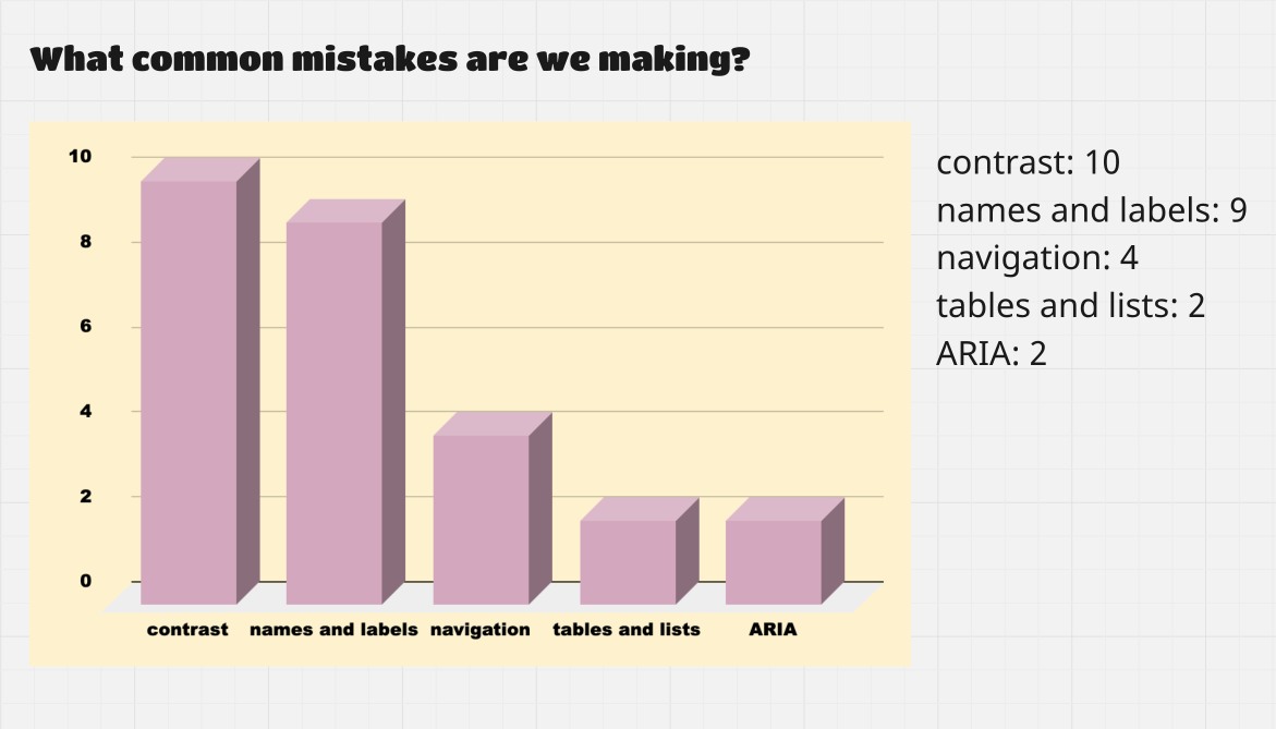
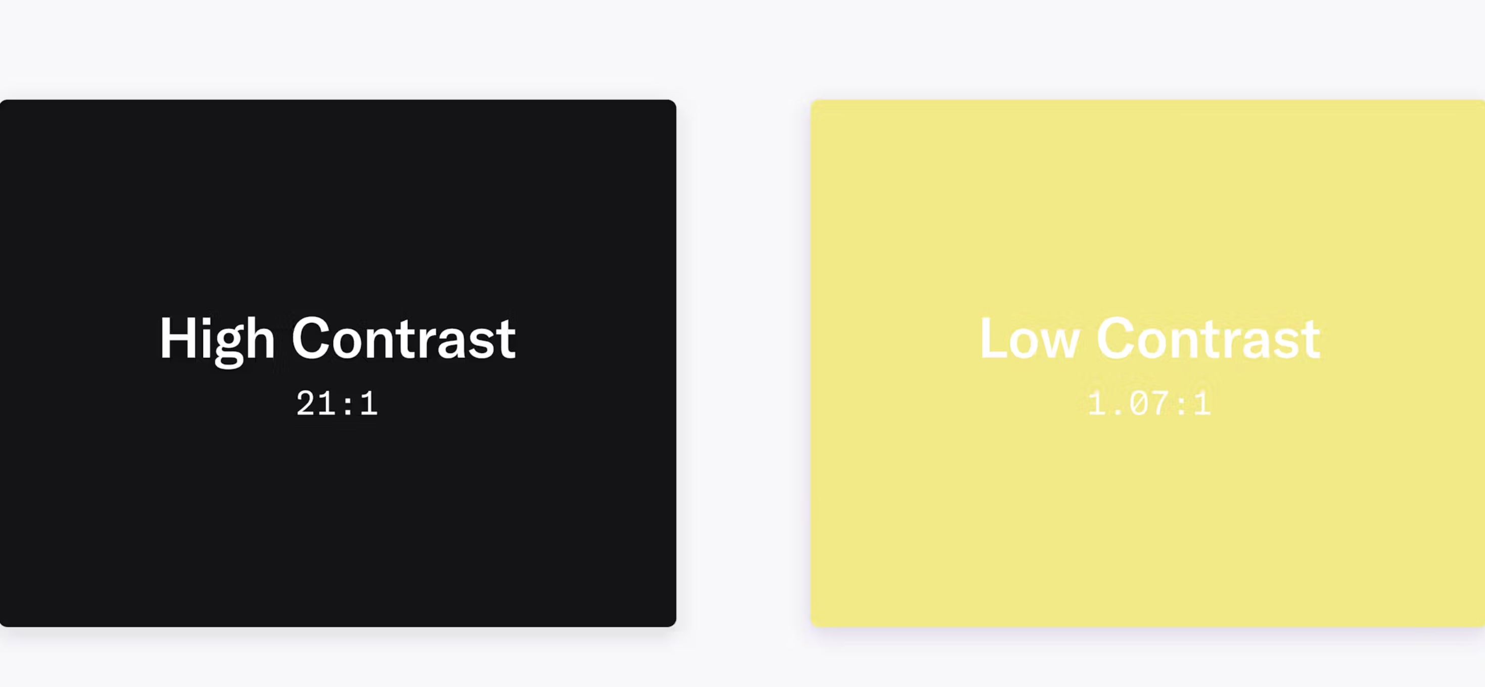
Contrast is defined as the foreground color vs. the background color. If the contrast between those two colors is low, the text is harder to read. Making things less accessible. The higher the number the better the contrast.
Colors
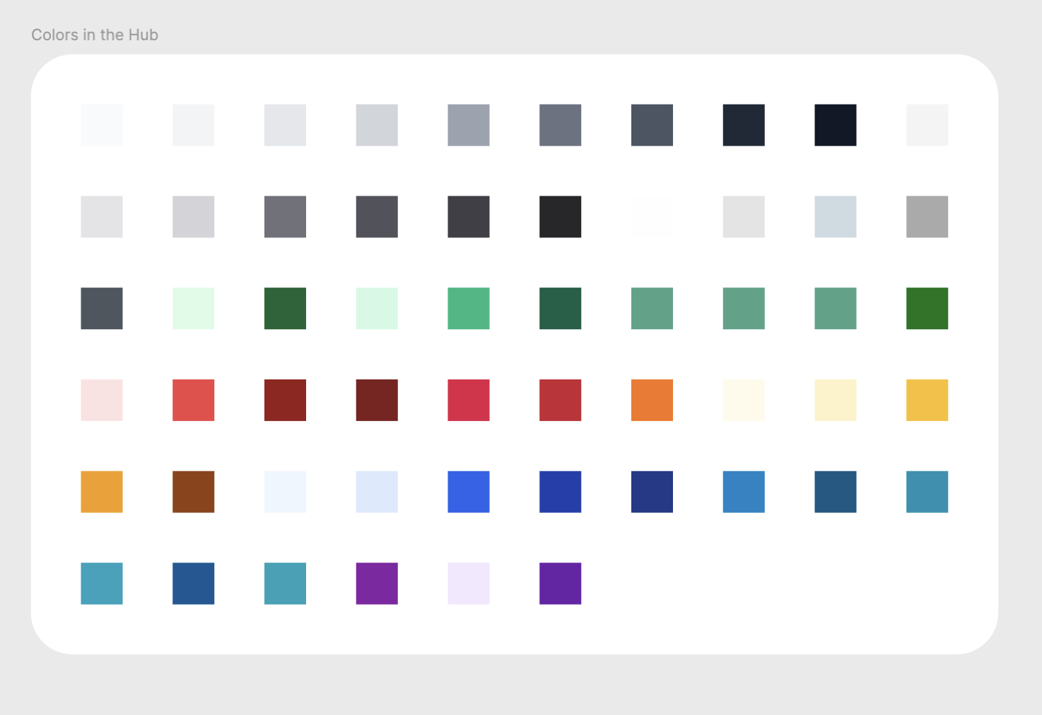
Knowing that color contrast is our biggest accessibility problem, my second audit was tallying all of the uses of color in the Hub. For scope reasons, we chose The Hub as a basis.
This audit showed that we are using a total of 21 grays, 6-7 shades of green, yellow, red, and 11 different blues.
This is too many colors per color family leading to consistency problems.
So in addition to our colors not having good contrast, we also are using them inconsistently. We hard code hex values in both Figma and GitHub.
Going foward, we are using Tailwind colors as the palette bases. Current Phoenix versions include Tailwind. We are already using Tailwind colors in The Hub.
Sky
is our main blue palette because
sky-800
is "Relay Blue." The rest of the chosen palettes are Gray, Red, Emerald, Purple, and Amber.
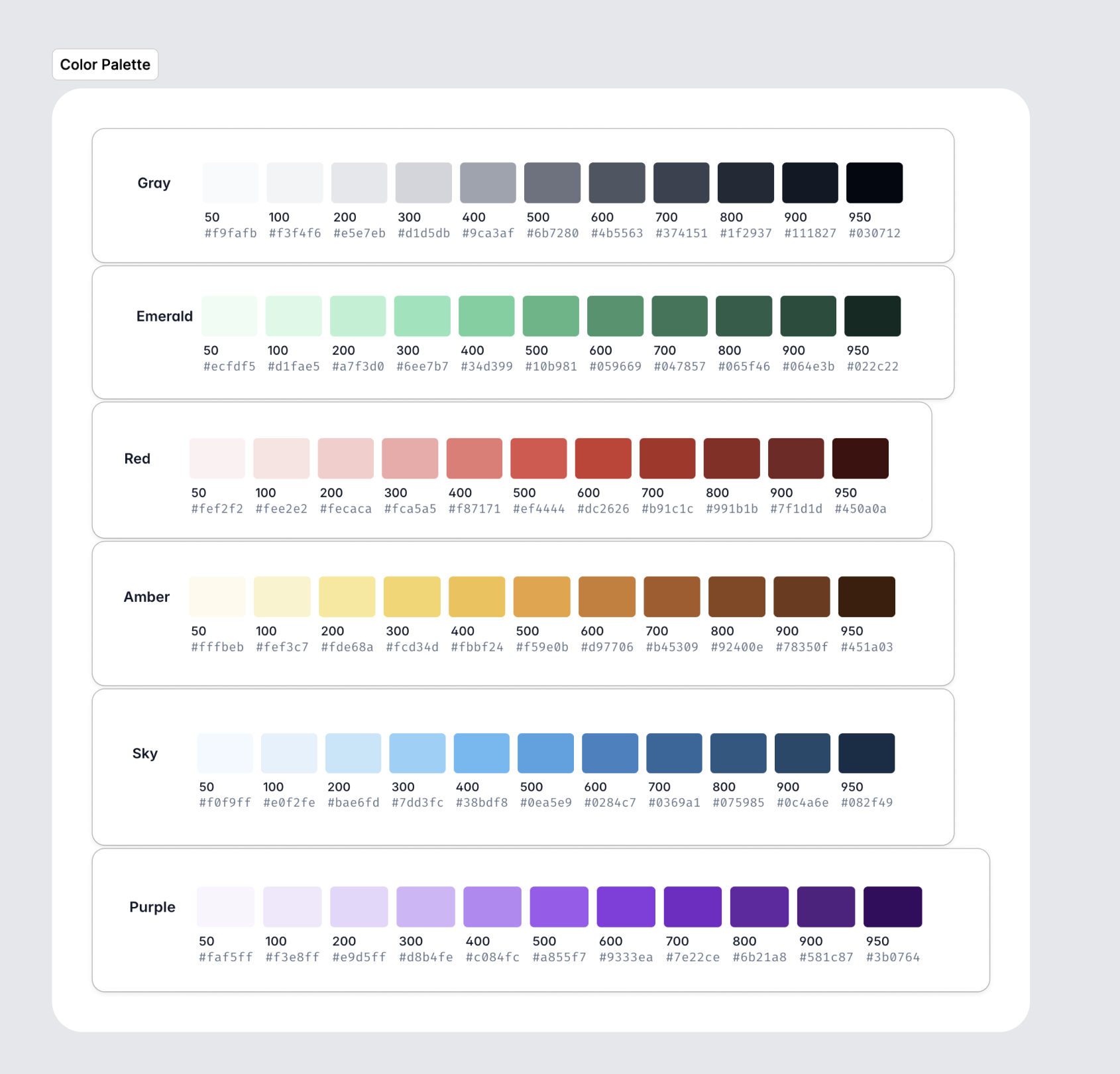
In addition to locking in the palettes for each color, we also checked their contrast. We used this Color Contrast Checker. We calculated the contrast values of various color hues vs. our default background of white. We adhered the highest standard of contrast for text and UI elements: AAA.
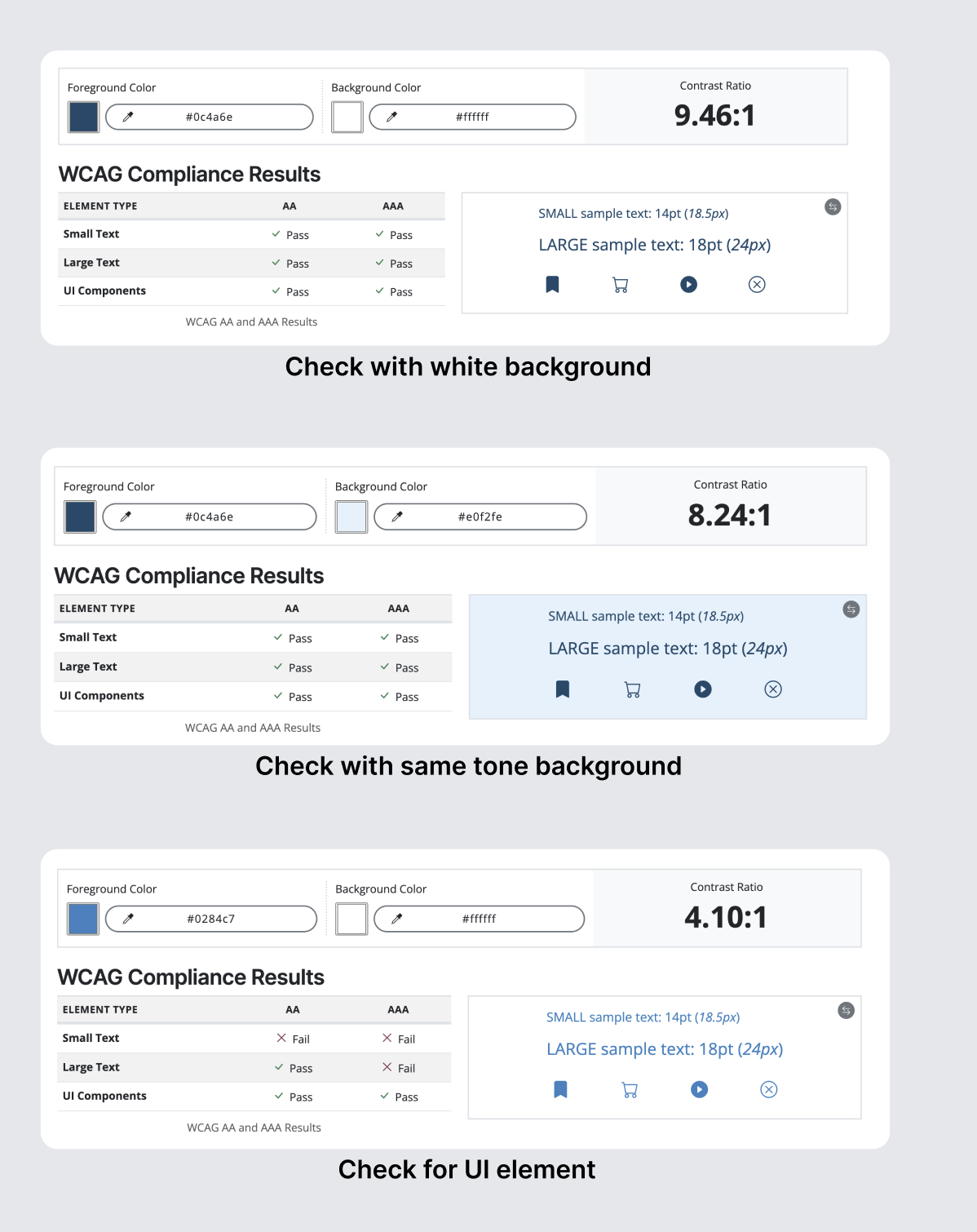
This was how we narrowed down the 11 colors of each palette to 3-4. For the most part, the colors consist of a background color, a UI element color (icon), and a foreground color (text).
Gray
Sky
Purple
Emerald
Amber
Red
How are we using color?
Turns out that chosing the color families and making them accessible was just the first step! The next step we took was figuring out how we are using color in our system.
Right now, we have the problem of gray being used as an action color AND also blue being used as action color. In standard web design practices gray has the connotation of disabled. For consistency, we switched to blue for action and gray for secondary.
Using the literal definition of the colors would be a first step to consistency (ex: amber-800). It would help in getting rid of those pesky hex values!
But how do you know when to use amber-800?
¯\_(ツ)_/¯
Semantic naming
Before we go about answering that question. Let's take a step back and think more generally about color and how it can be used. Here are a few helpful quotes:
Color is not used as the only visual means of conveying information, indicating an action, prompting a response, or distinguishing a visual element. WCAG
"Semantic refers to a way of naming colors based on how they are used as opposed to their hue."
With that in mind, we can see that color is not as important as the meaning.
Usage
Back to amber-800... it was a little bit of a trick question. 😈
Literal color names will not be seen by designers or developers. Instead they will see something like:
text-default
or background-transit.
This convention takes a little getting used to because you are no longer thinking visually "I need a dark purple." But instead "I need a text-invoiced."
The naming convention for semantic color variables is:
element+name
Element is best thought of in terms of what it is. A border. An icon. This is the most specific part of the variable name.
ex:
background
Name is what the variable does. Most often, it will be a state.
ex:
hovered
Note, you would never have a semantic variable with both foreground and background elements at once.
Bad ex:
background-text
The most imporant thing about semantic naming is thinking beyond the color of the UI element and instead what it does and when it used.
An action-button example with hover states.
How do I use these variables?
Good news, they are already in Kitt Figma and Kitt Storybook.
Please see Colors for examples of our UI elements with semantic naming.
Conclusion
We went from 56 colors to 19 colors. We went from 21 to 4 grays. We went from 11 to 3 blues.
Each color has a semantic name.
We are no longer hard coding color values. Colors are being used intentionally.
Most importantly, our color combinations are accessible.
Dark Mode 🌚
Chosing colors based on how they are used, contrast, and semantically naming them allows for future posibilities like dark mode!
Here is an example of what that could look like:
What's next?
A style guide is not just comprised of colors! Future work includes: typography, spacing, border radius, and page hiearchy.